LMS Authoring System
Skills: Workflow Design, UX Research, Usability Testing, UX/UI Design, Prototyping
Tools: Figma, Figma AI Tools, Teams (Usability Testing)
Portfolio
Skills: Workflow Design, UX Research, Usability Testing, UX/UI Design, Prototyping
Tools: Figma, Figma AI Tools, Teams (Usability Testing)
After the acquisition of PlayerLync at the end of 2023, Wisetail was growing from an LMS provider into a broader employee enablement platform, helping large restaurant and retail brands train and support their workforce. But our core learning content builder was falling short of meeting evolving client needs.
Although the builder was robust and easy to use, Admins couldn’t organize material into easily navigable sections, track learner progress in detail, or create an accessible course flow. Learners, in turn, got lost in deeply nested content, making it difficult to know what they needed to complete next. Summarized, our core findings were that:
Our challenge was to redesign the builder to support structured content and launch a new learner experience that offered clarity, trackability, and flexibility, all without losing what worked in the current system.
An admin builds out learning content and previews how it will appear to their learners. Simplified workflow to reflect overall builder experience.
I drove design from end to end: shaping strategy from research, crafting wireframes and prototypes, conducting usability testing, and guiding the product through to implementation.
I worked closely with our Product Manager, who led product direction, research synthesis, and cross-team alignment. I also served as the design liaison for the development team, clarifying functionality and reviewing implementation to ensure high-fidelity delivery across the builder and the learner experience.
The groundwork for this project began with client interviews and internal feedback. These pain points echoed across users:
These insights framed our opportunity: a structured builder designed to support courses and learning paths, and a learner experience that communicated what learners could expect from the material and where they were at in a course. I explored two directions: a lightweight content sequencer and a more robust Builder 2.0 with structured sections, subsections, and optional landing pages.
While the sequencer promised speed, Builder 2.0 better addressed real user needs. Choosing it meant setting aside my personal bias for what a course and learning path builder should be in favor of a collaborative, research-driven solution, which was a defining moment in my growth as a design leader.

Early exploratory wireframes of the learning content builder. Lightweight content sequencer (left) and more robust builder (right).
With a clear direction, I built a mid-fi prototype and began usability testing early. The response was immediate: sectioning content wasn’t just a nice-to-have, it was foundational. Admins also appreciated the polished look of landing pages, but they wanted flexibility to toggle them off for simpler modules.
On the learner side, I designed a new experience that also included all the functionality of the existing learner tool. Notable additions were: a persistent progress indicator, clear entry and exit points for each section, a flexible structure that minimized content nesting.
Working closely with developers, I clarified functionality, answered edge cases in real time, and ensured fidelity to the design intent across branding variations and less-documented components.

Pre-redesign (left) learner experience course content page and early draft (right) of the learner experience course landing page.
We also began designing a new report focused on surfacing actionable insights: section-by-section completion, course-level engagement, and assessment effectiveness. During initial testing of report mockups (which I won't show here as it's still a work in progress), earlier feedback was reinforced. Admins wanted to know where their learners were getting stuck and exactly where they were in their learning journey.
This was integral to guiding which data we'll surface in the report and is helping us get buy-in from stakeholders on what we choose to prioritize. By engaging our clients early on in the process, we can ensure it will actually help admins improve their content and support struggling learners.
While the Admin Tool used a mature design system, the Learner Tool had none. We moved faster than expected and what started as a "refresh" became a full rebuild—without a framework in place. I hadn’t spec’d behavior for every new component, and the team had to make real-time decisions during development.
That experience led to important changes. During our project-specific retro, I proposed:
Our process wasn't perfect, but the result is a stronger foundation for every learner-facing release moving forward.

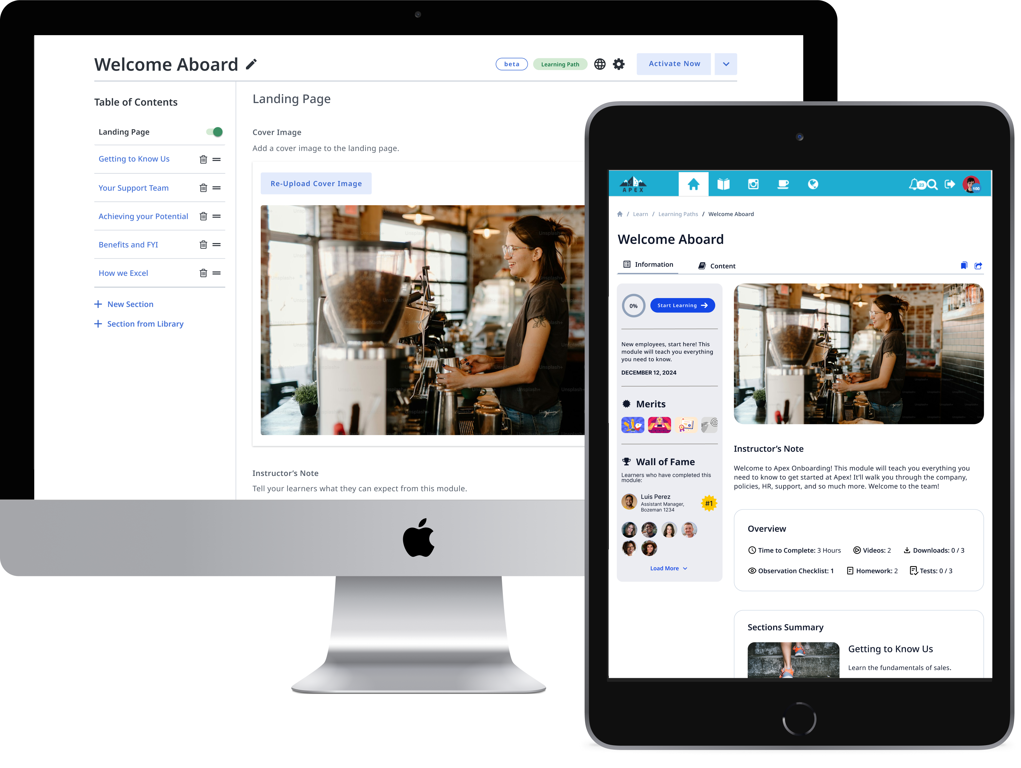
Final designs of the admin tool builder landing page (left) and content page (right).

Final designs of the learner experience landing page (left) and content page
Builder 2.0 and the new learner experience are now live with pilot clients. Feedback is ongoing. It was a challenging undertaking and I learned a lot along the way: Put users first, even when it challenges your initial vision. Flex your design systems, but know when to define new patterns. Proactive design–dev collaboration is non-negotiable when systems are loose. And Usability testing isn’t a "phase" of a project, it’s a mindset that should be used throughout the entire lifecycle of a product.
This project transformed not just our builder, but the way learning is built, delivered, and understood on our platform. I’m proud of the result, but just as proud of the collaborative, thoughtful—though imperfect—process we modeled to get there. I look forward to iterating based on feedback and the challenge of building a more mature design-dev handoff process going forward.
Updated by J. Amelia Cáceres in 2026 | jessames.caceres@gmail.com