Financial Services Websites Redesign
Skills: Rebrand, Information Architecture, UX Writing, Responsive Design & Development
Tools: Figma, WordPress, HTML/CSS
Portfolio
Skills: Rebrand, Information Architecture, UX Writing, Responsive Design & Development
Tools: Figma, WordPress, HTML/CSS
IRA Financial is financial services company that offers self-directed retirement structures. They have a large digital presence and produce a wealth of content on social media. Plans can be established using the IRA Financial app.
Although the company was retaining clients and the primary website was doing well, the owner felt their existing brand did not reflect his vision or the values of the company, and additionally was not unified across their properties. They have two main websites (two companies under the IRA Financial umbrella) and many other smaller websites. The websites were not optimized and were on an outdated platform, making them difficult to update and integrate new useful features. Their wealth of content had capitalized on keywords, but it had led to an overwhelming navigation menu and many pages with little content. Finally, they had a Google Ads campaign that needed to be refined and updated.

2018 Original IRA Financial Group Website
At first, the digital team consisted of an IT Specialist who wore many hats, a writer who produced all the blog and Forbes articles with the owner’s help, and me. Since then, it has grown into a bigger team. My initial role was to rebrand the company to align with owner’s vision, ensuring brand and messaging consistency, and redesign the landing pages and websites, aiming to improve content structure and navigation. I also architected the websites’ content move to WordPress, including optimization and restructure, and developing the sites.
I performed an analysis of the existing main websites as a user attempting to find information and as a designer looking for content structure, functional, and aesthetic improvements that could be made. I spoke to the owner and head specialists about what the clients liked, what they tended to be confused about, and what they felt was missing on the site or was difficult to find. I reviewed competitor websites and discussed them with the owner to gain insight about what was succesful in the industry and what set his business apart.
I learned that part of the websites' success had come from an SEO company that had used practices that were now being penalized by Google. Fixing this was a priority. Clients reportedly often found the content difficult to navigate, and there seemed to be a lot of confusion among them regarding the company’s main purpose and their services, the details and pricing of the plans, and their digital presence. And although the company had very good testimonials, the look of the site did not inspire confidence despite the generally positive experiences of clients establishing and maintaining plans with them. Additionally, their Google Ads landing pages would need to be revamped to further help traffic and sales.
Working closely with the owner and head specialist, I first created a brand package and style guide for the company, which would inform the redesign of the websites. I proposed several ideas for a new navigation and site map that could be more intuitive for users without sacrificing the findability of site content, and started to adress some SEO issues. I then proposed new home page designs that focused on the aspects of the company that were most important for users and company identity, as well as designs for the rest of the site.
Being a small company, we didn't have many resources to perform rigorous testing; however, we did that have the ability to push out changes quickly and test how clients responded to them, improving as we went along by paying close attention to feedback from both specialists and clients. We also got useful data from the Google Ads campaign, allowing us to hone in on the most effective landing page templates and calls to action. I continue to work closely with the owner and team to improve the site and update it needed.

2019 IRA Financial Group Website (left); 2020-current (at time of writing; right). We underwent a second redesign due to the owner wanting to move toward a more minimalist and monochromatic aesthetic in 2020.

I created several landing page templates for the Google Ads campaign, which allowed us to find the most effective information presentation and design. These templates performed consistently better.
Our efforts to better communicate company values, improve user experience, revamp SEO, produce more and better content, and integrate Google Ad campaigns resulted in more conversions and improved client experience and sales. We had a lot of feedback that the site looked great, although we got some good notes about pain points in the content structure, which we continue to improve. One of the most important lessons I learned had to do with the website move--the the IT and I were novices when it came to the SEO details of migrating large websites, which resulted in a temporary loss of traffic. It was later regained, but it was discouraging to perceive our hard work as actually damaging traffic in the short term.

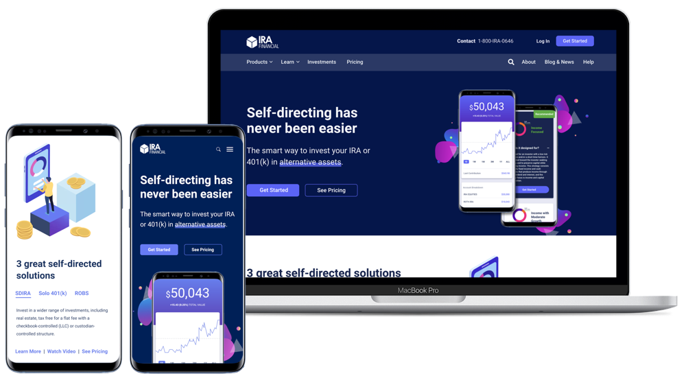
Proposed navigation and footer updates for 2022. This version adds important links to the navigation; it also groups information in a more logical way for both navigation and footer.

Proposed design updates for 2022. Among other things, this design lightens the dark blue background to create a less harsh appearance, while maintaining the stark contrast the owner prefers. It also squares off the buttons to align with the logo.
Being an in-house designer, I'm fortunate to be able to continue to make improvements to a project I am very familiar with. It's also been amazing to bring in new people to the team as we continue to grow. The project as such is never really "complete"--it's in a constant state of revision, which can be frustrating in a small company with no established process, but also extremely rewarding. I've really had to learn to iterate quickly and be comfortable publishing things that are not perfect under tight deadlines.
Updated by J. Amelia Cáceres in 2026 | jessames.caceres@gmail.com