Analytics Dashboard & Sharing Workflow
Skills: Data Visualization, UX Research, Usability Testing, UX/UI Design, Prototyping
Tools: Figma, Teams (Usability Testing)
Portfolio
Skills: Data Visualization, UX Research, Usability Testing, UX/UI Design, Prototyping
Tools: Figma, Teams (Usability Testing)
Wisetail is a learning and development platform; their goal is to support and strengthen their clients' learners to ensure that their brand promise is delivered. In addition to offering a host of content building and authoring tools, they also provide learning insights that aim to empower clients to make data-driven decisions.
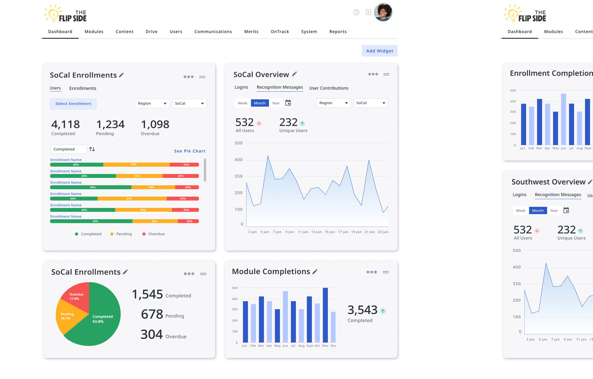
Wisetail faced a challenge in efficiently managing and visualizing the extensive data generated by their Learning Management Platform. This included student performance metrics, course popularity trends, and user engagement analytics. The goal was to create a comprehensive dashboard that would enable administrators, especially non-technical ones, to glean actionable insights from the data to improve learning outcomes and operational efficiency.
A Super Admin creates a custom dashboard to be published. An Admin receives a notification that a new dashboard has been created for them and navigates to it.
I led UX/UI design for this cross-functional initiative, working alongside developers, QA engineers, and a product manager. I partnered closely with the PM to synthesize stakeholder input into a clear product direction focused on delivering actionable insights to administrators.
Throughout the project, I collaborated with developers to ensure that our data visualizations were not only scalable but also meaningful and intuitive. I pulled from my Technical Communication academic background to design drafts of a data experience aligned to meet real user needs. I designed wireframes, interactive prototypes, and high-fidelity UI, leading usability testing to validate the dashboard’s effectiveness and iterating based on user feedback to refine the experience.
Our goal was to create an administrator dashboard that transformed complex datasets into clear, actionable insights. Collaborating closely with the PM, we aligned on the project’s core objectives by synthesizing stakeholder input and user needs. From there, I led the design process—starting with exploratory wireframes and low-fidelity prototypes to test different layouts and data visualization patterns.
We relied on a third party (Highcharts) to deliver the data visualizations. Partnering with developers, I ensured each visualization was both technically feasible and meaningful to end-users. I used Highchart's approach to data display and applied our strategy and design language to ensure development was smooth. Usability testing with representative administrators played a key role throughout, allowing us to identify areas of confusion, refine interactions, and clarify data hierarchies. Feedback from these sessions directly informed iterations that improved the dashboard’s usability and visual clarity.

Early drafts of the dashboard widgets.
The result was a highly usable, interactive dashboard that empowered administrators to track engagement, evaluate learning outcomes, and make strategic decisions based on real-time data. Early testing and post-launch feedback highlighted strong satisfaction with its accessibility and clarity.
Looking ahead, we’re expanding functionality to include the ability for admins to publish custom dashboards their people managers, improving transparency and communication across teams without overwhelm. Additional UI refinements and enhanced filtering options are also in development, based on continued testing and usage analytics. This iterative, feedback-driven approach has helped ensure that the dashboard remains a living tool—designed not just for data display, but for real-world impact.

The Enrollment Widget, which faced some data engineering challenges. There was healthy tension between engineering and product/design regarding the best way to represent the data and make it most accessible to users.
This project reinforced the importance of strong cross-functional communication and the ability to advocate for design decisions in spaces where priorities may differ. One key moment involved navigating tension with an engineer who was deeply invested in data integrity but hesitant to prioritize user experience. Through this experience, I learned how to adapt my communication style and frame design decisions in ways that resonate with different stakeholders, especially those less familiar with UX language or principles.

The Dashboard Widgets, with potential UI improvements that will help admins better understand them as "moveable" and configurable by making them contrast more with the background.

The Data dashboard, with potential smaller widgets and the new ability to publish custom dashboards to other admins. This empowers Super Admins deliver customized data views to their people managers without overwhelm.
I also gained deeper appreciation for the collaborative nature of effective data visualization. Creating a dashboard that translated complex backend data into accessible, actionable insights required constant dialogue between disciplines. Iterative design and testing were essential to aligning the interface with the real-world needs of non-technical users, our primary audience.
Finally, I learned that designing for clarity is critical when working with large data sets. Striking a balance between depth and simplicity was key to driving adoption and helping users feel confident interpreting and acting on the information presented.
Updated by J. Amelia Cáceres in 2026 | jessames.caceres@gmail.com